art programs (my mains)
i have, by my rough estimate, used over 30 different art programs over the years. i have reliable standbys, of course! but in general, i love experimenting with different tools. what kind of features are available in other art applications? do technical limitations make it more interesting to use, or more frustrating to use? what's the UI/UX like? how do the brushes look and feel to use? etc.
out of everything i've used over the years, here's my current lineup of preferred art programs.
krita
so, in the past year or so, i switched to Krita as my main "high resolution" drawing program. i used Clip Studio for several years (2016-2023) but ever since i switched to Linux as my main OS, i needed to familiarize myself with something that would run natively.
and... i've been pleasantly surprised by Krita! when i usually think of FOSS (Free and Open Source Software) i tend to imagine applications with absolute garbage UI/UX design. like, you know, the GNU Image Manipulation Program. just completely miserable to use, usually designed by people who mostly only know how to code, and make little-to-no considerations for the end user. (as you might be able to tell: i really, really fucking hate GIMP. my hatred has been burning since the mid-00s and it is still just as strong as ever.)
on the other hand, Krita's layout is closer to the kind of experience you'd get from a program like Clip Studio. although, i'm not a big fan of the default layout, but that's OK. it's pretty easy to adjust. for example, here's the default layout:
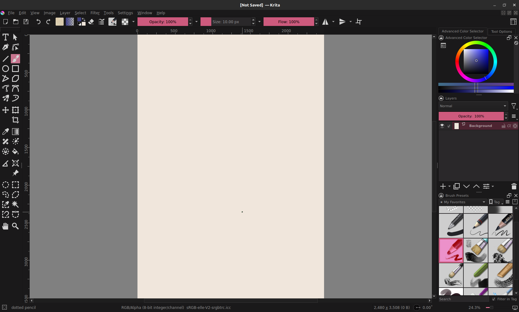
i don't like how squished the layers panel ends up feeling here, and i really benefit from having a zoomed-out navigator panel, for quickly panning around the canvas, zooming in/out, rotating, etc. so, after some trial and error, here's the layout that i'm happier with:
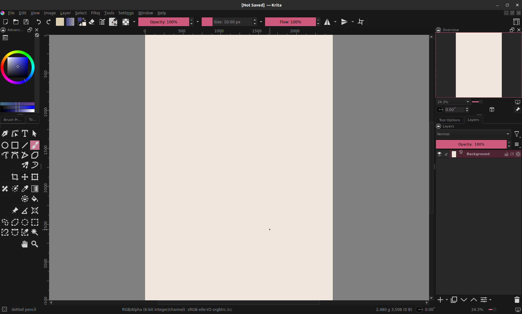
this is pretty close to how i've set up Clip Studio in the past, and other art programs i've used. i also took out the panel on the right that had the brush selections. it felt redundant to me in practice, since there's a button on the top bar that brings up a drop-down menu of different brushes, along with the right-click pop-up menu that brings up brushes as well.
one of my biggest complaints about Krita so far... i miss having adjustment layers!!! so much!! it was VERY useful in Photoshop and Clip Studio to have non-destructive adjustment layers, for tweaking contrast or adding gradient maps, etc. Krita has these only available as filters, which will apply changes directly to the layer, instead of giving you the option to toggle it on/off at will. once you apply a filter, the only way to get rid of it is to undo. i've kind of worked around this by only applying gradient maps/contrast adjustments when i'm done with an image, and make a flattened layer copy of the image to run filters on. but it's not great... Krita, please add adjustment layers someday...!!
UPDATE: i am a fool. it's under Layers -> New... -> Add filter layer. all this time...!!! that's on me i think. i thought i looked around thoroughly but i totally overlooked that.
also... i wish you could move around and rearrange the tool icons on the left there. they're in a fixed order and it's kind of irritating to me. but whatever.
on a more positive note, i honestly love the brushes i've been using on Krita. a lot more than the ones i had been using on Clip Studio for years! i kept trying different brush packs on Clip Studio, tweaking them, feeling like it wasn't quite right... and then by happenstance, i find ones in Krita that work perfectly with my workflow.
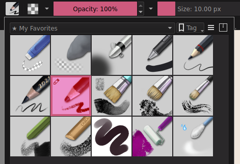
my preference definitely leans more towards big, broad brushes that are slightly textured, with narrower pencils for detail work. i mostly use the currently-highlighted pencil brush for sketching, and the two chalk brushes in the bottom row for coloring and rendering. but the other ones have their uses, too - you see the paintbrush on the middle row, all the way to the right there? that one's perfect for rendering hair texture. hehe.
oh yeah! Krita also has several presets for keyboard shortcuts that match the defaults on other programs (Photoshop, SAI, Clip Studio, etc), making the transition from other programs a little easier. i think that's a neat feature.
all in all, i'm pretty happy with Krita, and i don't tend to miss Clip Studio too much. the lack of adjustment layers is the main thing i really yearn for... feel like shit just want her back... but maybe i was depending on them a little too much, so maybe it's not the worst thing in the world. lol. statement redacted now that i know adjustment layers exist. the main thing that i miss from Clip Studio is the selection brush tool. it was really useful to literally paint blobs of marquee selections instead of having to use the lasso. but that's just me.
aseprite
yay, aseprite! i'm sure a lot of people who do pixel art for gamedev are very familiar with aseprite. it's a very lovely program designed first and foremost for pixel art. it has tons of little tricks up its sleeve that make normally-tedious workflows into a piece of cake. i'm particularly fond of the indexed palette functions, making it a snap to create art with limited color palettes, with no risk of pesky unintended colors sneaking in.
i'm not a spriter by trade - most of my art background comes from illustration - so i mostly use it for lower-resolution art. and it's GREAT for that! people might not be aware, but aseprite has tablet pressure sensitivity support. in most art programs, you can vary the opacity of your brush based on how hard you're pressing down with the pen nib. in aseprite, you can use this to create pixel dithering:
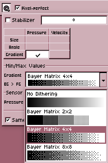
which, imo, is VERY cool. i'm a big fan of how dithering looks in lower-resolution artwork, but it's very tedious to do it by hand, and most modern programs don't offer tools to make it easier. but this makes it really intuitive! i've used it a lot, and it feels very satisfying to do.
one thing that can be a little annoying for me... i don't like that the layers tab goes hand-in-hand with an animation timeline, with no way to separate the two. i understand why this is the case, and from what i know, it's a godsend to people do who sprite animation. but, for me, it just gets in the way... i really wish there was a "new layer" button on the layer panel, too. but all of the visible buttons are all timeline-related. so i either have to use the top menu bar and navigate Layers -> New... -> New layer, or use a keyboard shortcut. i use keyboard shortcuts quite a lot on my desktop, but it's significantly inconvenient for me to on my laptop drawing setup. just gimme a button to tap...
since i have no use for timeline features, i've moved the layer panel to the right and made it super narrow. this gives me more horizontal room to draw, and there's significantly less "wasted" space onscreen. that's just what i'm used to, anyway.
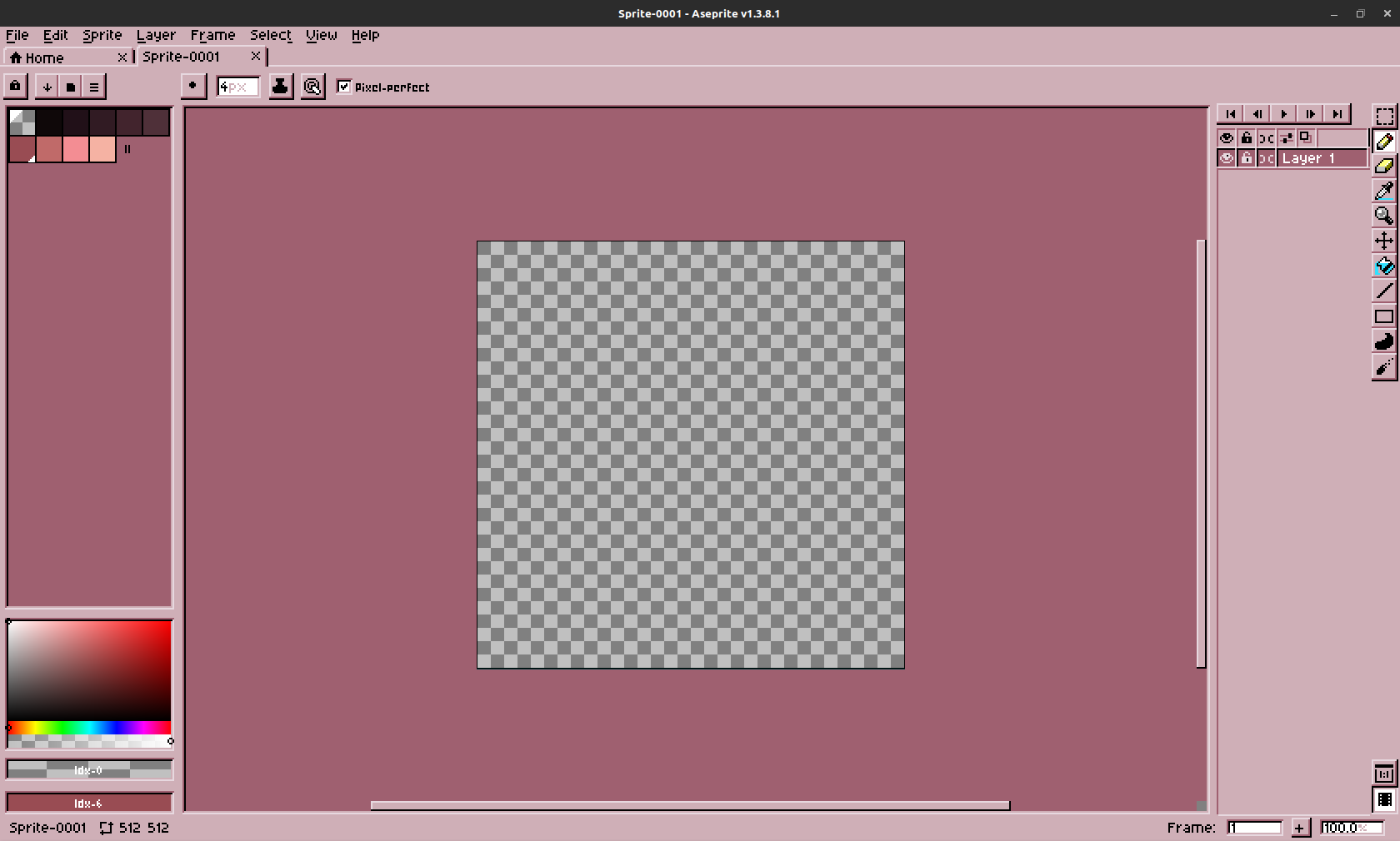
oh! and if you're wondering, i'm using this wonderful Aseprite 95 theme. it really makes it feel cozy to me. i like the default theme fine enough, but drawing in a win9x-inspired environment feels right to me, hehe. bonus points to the theme author for including some color schemes based on official win9x color schemes, including OBJECTIVELY the best one (no bias at all), Rose Pink.
ms paint (windows xp)
and no i am not fucking kidding. i am dead serious. not modern day windows paint - get that ribbon interface out of my sight. no, i'm still using good ol mspaint.exe yoinked straight out of an XP installation. i even set it up with Wine so i can use it on Linux!! you can't pry MS Paint away from me, even if it was out of my cold, dead hands.
i just like how simple it is. loads up instantly. i can start doodling immediately. i like the way the brush shapes feel - the chunky square one gives a pretty neat texture to shapes, and the angled ones can allow for some interesting line variation. there's a lot of hidden tricks you can do; my favorite one is using the eraser tool to replace a color. make the foreground color the color you want to replace, and the background color the color you want to change it to. use the eraser tool with right click, and it'll selectively replace the color you want to change, without touching any others. SUPER handy.
i just wish the color picker wasn't so miserable to use. that's like, my one complaint about MS Paint. lack of layers? oh, whatever, that just means one less thing to worry about. that's OK, i don't care. giving me that color picker from 1995? ugggghhhhhh. my way of working around that is to paste in a premade color palette, usually from lospec, and work from there. if 25 years wasn't enough time to wrap my brain around the default Windows color picker, i don't think it's going to anytime soon.
but really, i sincerely love using Paint for quickly sketching up thumbnails, or doodling people's cute cats, drawing for fun, etc... it's an environment where i feel very little pressure to create something ultra-polished, and i can just draw without overthinking everything. i'll always love you, MS Paint.